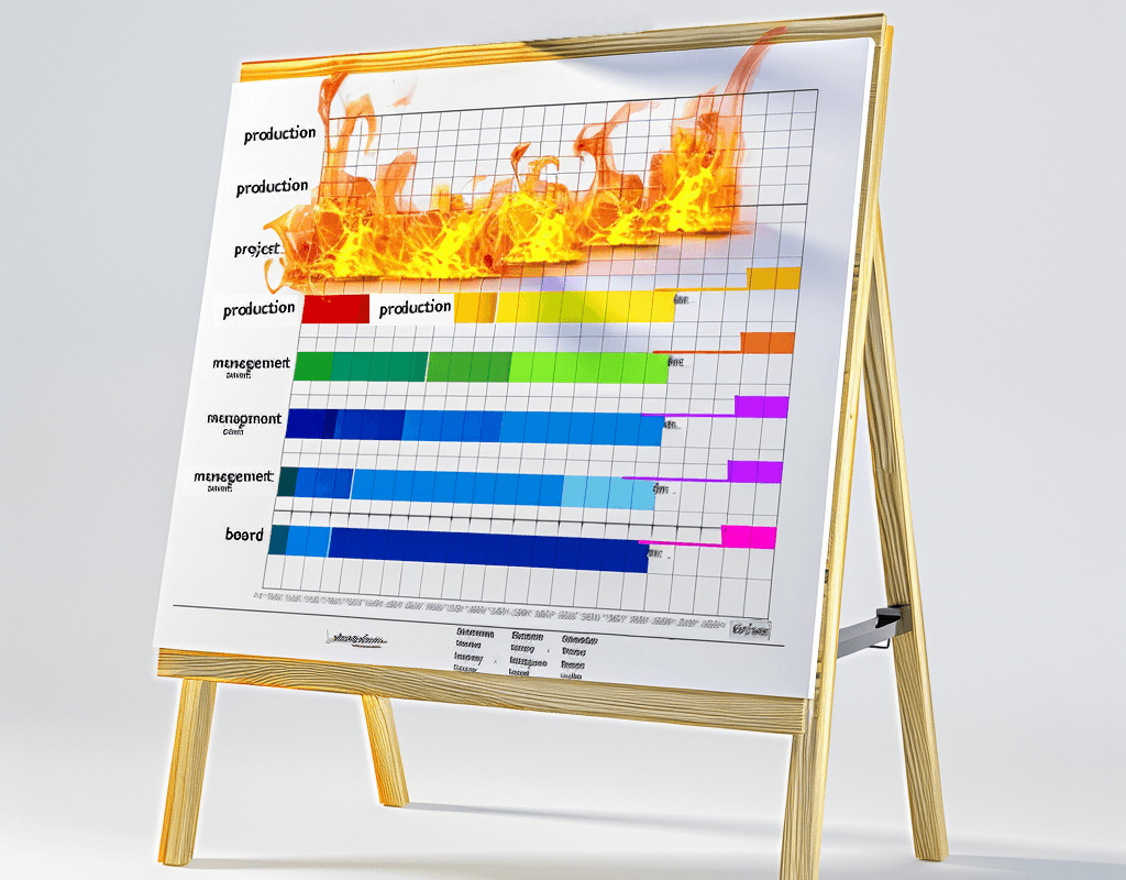
Liar-liar Gantt chart on fire
Why Capacity Heat Maps beat Gantt charts

Sr. Program Manager, Cloud Products & Governance at Warner Bros Discovery
Most project managers struggle with accurately estimating timelines for new teams with new types of projects.
The challenge with estimating anything new is its unfamiliarity. With no established benchmarks or historical metrics to rely on it is difficult to estimate the required effort. Additionally, projects that venture into uncharted territory make it difficult to anticipate the what challenges will be encountered along the way.
Gantt charts are a great tool for visualizing project timelines, but on unpredictable projects, where estimates are based on wishful thinking and guesswork, Gantt charts are misleading. And then when stakeholders misinterpret a fictional Gantt chart as a promise, getting them to agree on a change of scope may become impossible.
When stakeholders view a Gantt chart as a rigid plan, the project manager loses the flexibility to adapt. When discrepancies between the charted timeline and reality become evident, stakeholders may question the project's management, causing an erosion in trust and creating unnecessary tension.
To overcome these perils I use "Capacity Heat Maps" to manage expectations. It's the effective way for project managers to visually communicate the reality of project timelines, when dealing with the unpredictable nature and unforeseen constraints of a unique project.
Capacity Heat Maps are more effective because they address the problem of inaccurate estimates by continuously recalculating capacity as the project progresses. This allows for dynamic adjustments to expectations, clearly indicating capacity dedicated to high-priority work streams along with reduced expectations for lower-priority ones when bandwidth is limited.
Beyond addressing inaccurate estimates, Capacity Heat Mapping maintains the visual clarity of a Gantt chart, making it easy for stakeholders to understand. By displaying capacity estimates as activity swim-lanes, it clearly shows which activities have allocated capacity and which activities will receive less effort due to constraints.
This allows you to present stakeholders with a real-time picture of project risk and execution, avoiding the trap of committing to an unrealistic timeline based on faulty estimates. Maintaining this credibility with stakeholders is crucial for project success.


